Dazzle
UX Design | UI Design | Prototype
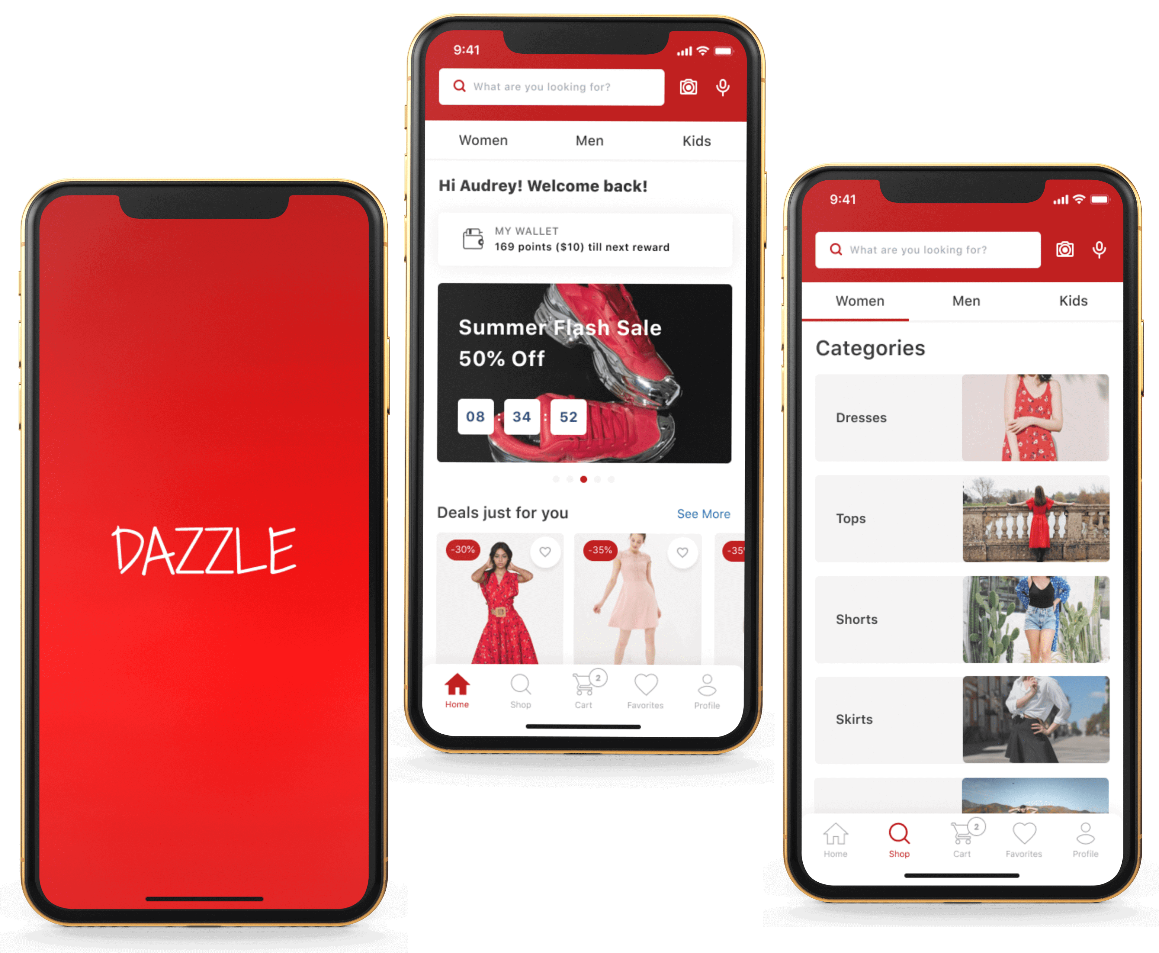
Dazzle is an e-commerce mobile shopping app that focuses on helping customers find the right product and making their online shopping quick and easy.
VIEW VIDEOProblem
The retail industry is constantly changing and there are always new challenges in this competitive industry. Online retailers are spending a significant amount of money driving traffic to their online store. Existing research has shown that acquiring a new customer can cost five times more than retaining an existing customer. That’s why in this competitive landscape, online retailers need to find ways to convert existing customers into repeat customers to increase ecommerce sales.
Solution
To solve this problem, I created a design that focussed on highlighting the needs of these existing customers and addressing their problems thus motivating them to keep coming back for repeated purchases and reducing the frequency of cart abandonment.
Process
User Interviews
I conducted in-person interviews with online shoppers to get answers to three questions:
- What motivated them to make another online purchase from the same site/app?
- What challenges do they face when trying to make an online purchase?
- What are the reasons for cart abandonment?
User Interview Results
- Online shoppers are motivated to make another purchase if they find coupons, discounts, deals, promotions and benefits
- They love shopping in apps/sites that are easy to navigate
- Their main frustration is the difficulty in searching and finding a specific product
- They also find it difficult to judge the quality of products just by looking at pictures & description
- They find it difficult to decide if multiple varieties of a product exists
- They get frustrated when they are not able to get help quickly
- They get frustrated when they can’t easily get information about the return policy
- They find it difficult to predict the exact arrival date of their package
- They don’t appreciate last minute surprises e.g., increase in the final cost due to shipping charges
From this data I got a better understanding of existing customers' challenges & frustrations and the reasons why they abandoned their carts even though they may have intended to make another purchase.
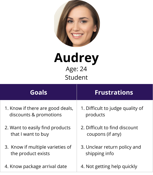
User Personas
Next I created a user persona to highlight an existing customer's goals and frustrations.
Competitive Analysis
Then, I studied two of my competitors Amazon and Wayfair. While Amazon provided users with a lot of selection and great benefits, their UI is cluttered and they do not categorize their products clearly which made it difficult for users to find specific products quickly. Users also found it difficult to judge the quality of products just by looking at pictures and videos. Instead they had to rely on reviews written by other customers. In the case of Wayfair, products are well categorized and the site is very intuitive, however, many users complain that the items they receive do not match the pictures in the product page. To rectify this problem Wayfair has incorporated AR features in their site, but this is limited to only a few products and hence not helpful in all cases.
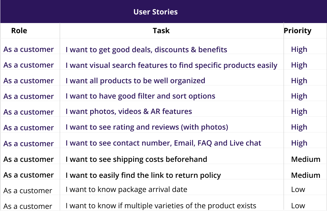
User Stories
With a better understanding of my users' needs and their challenges, I moved forward with creating user stories to capture product features and functionalities.
User Flows
I then created user flows to define the various steps a user might take. Not only would this allow me to focus on what the users need to do in order to complete each task, but also deliver the experience in the most effective manner possible.
 VIEW USER FLOWS
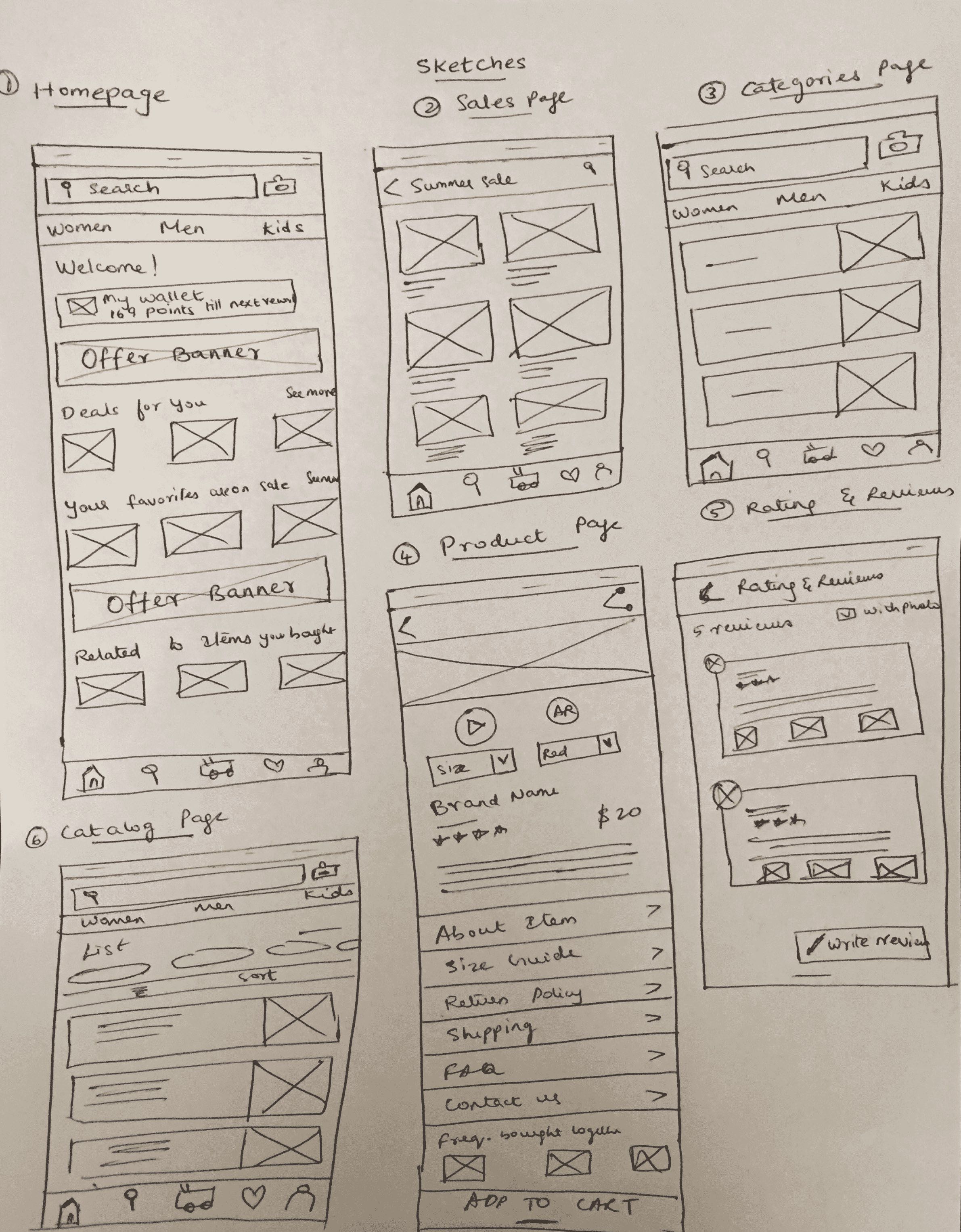
Sketching
Once I organised all the insights I gained from the research phase, I began to design the app. First, I began to sketch several of the site’s main screens using my user flows as a guide.
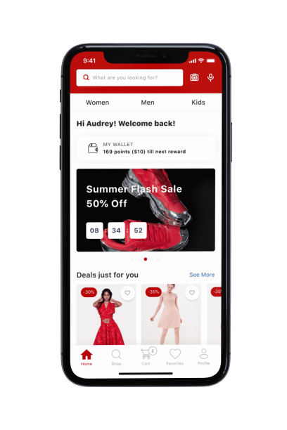
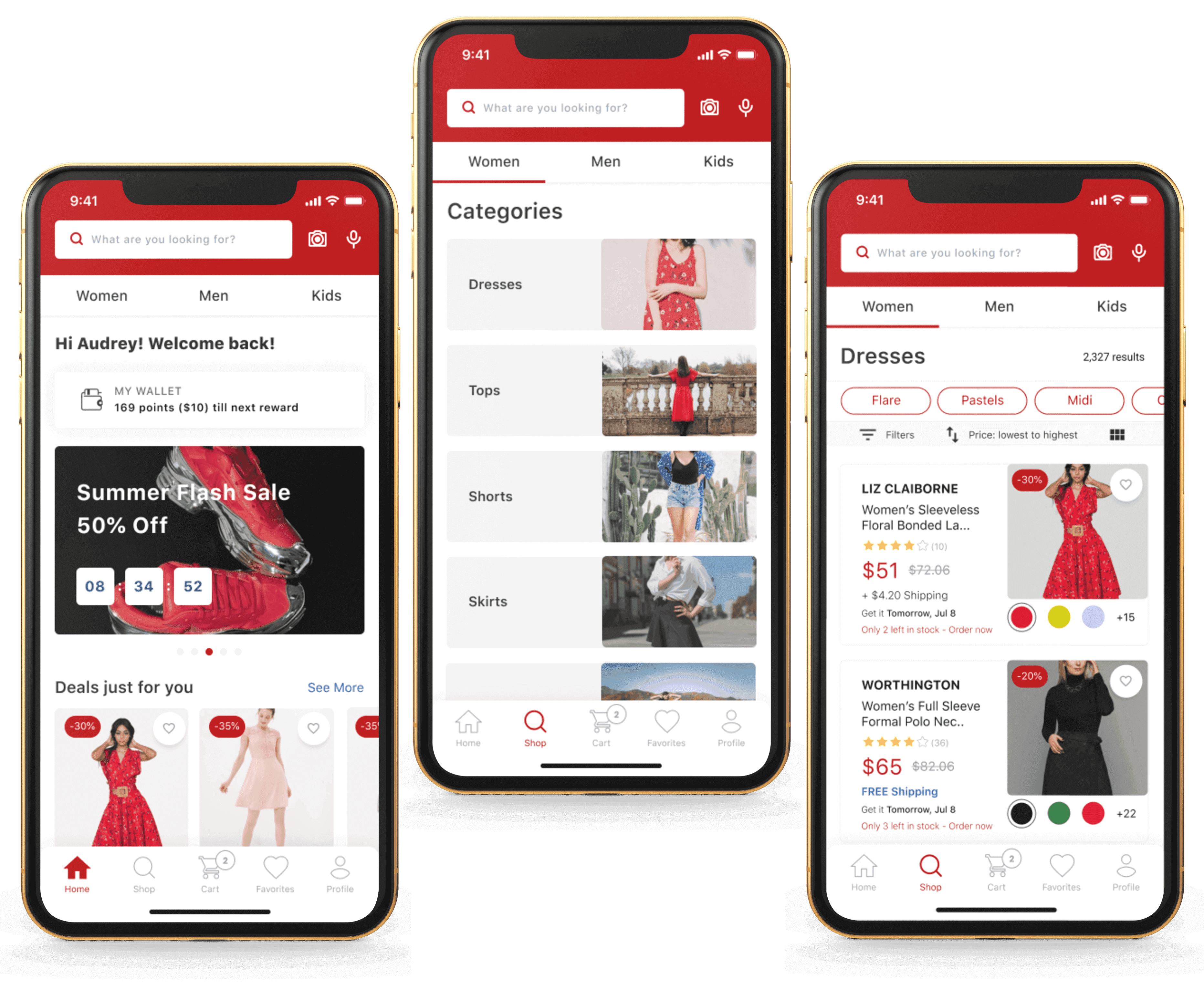
While sketching the homepage I mainly focused on providing a personalized experience to existing customers. I also focused on providing features that could motivate them to make another purchase (e.g., showing users current deals & discounts, letting them know if their favorite items are on sale etc.,).
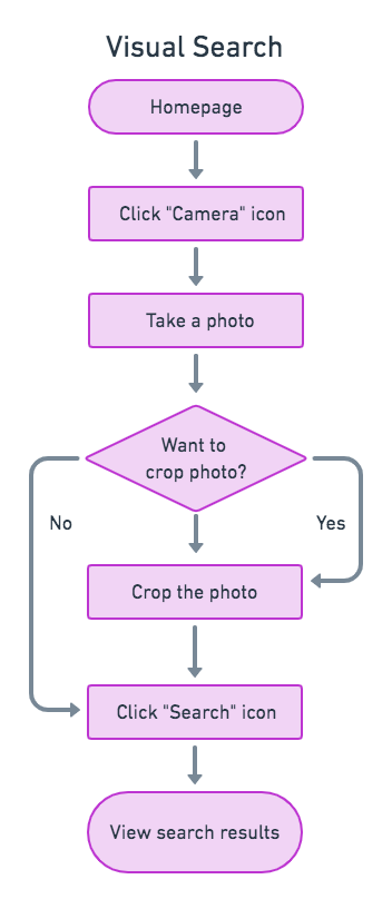
Also, in addition to the regular search bar option, I provided a visual search feature that could help customers to easily search for specific products.
Next, I focused on keeping all products well organized to make the search easy.
When sketching the product page I also focused on showing all the information that was needed to help customers make a decision.
I also provided an Augmented Reality feature to help customers see how the product would look on a real person.
Finally, in the cart page I provided options for customers to view and apply available promo codes.
Wireframes
Next, I began to design wireframes using Figma. I made sure to prioritize the features that would best address the needs of existing users.
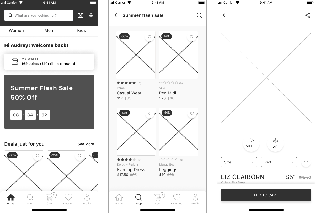
Hi-Fi Mockups And Preference Testing
Finally, I created high-fidelity mockups using Figma. I also conducted a preference test to decide which layout customers preferred for the category page.
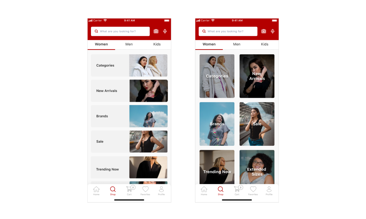
Majority of test participants preferred option A because they felt it was easier to navigate in a list view compared to a grid view. So I decided to move ahead with option A.
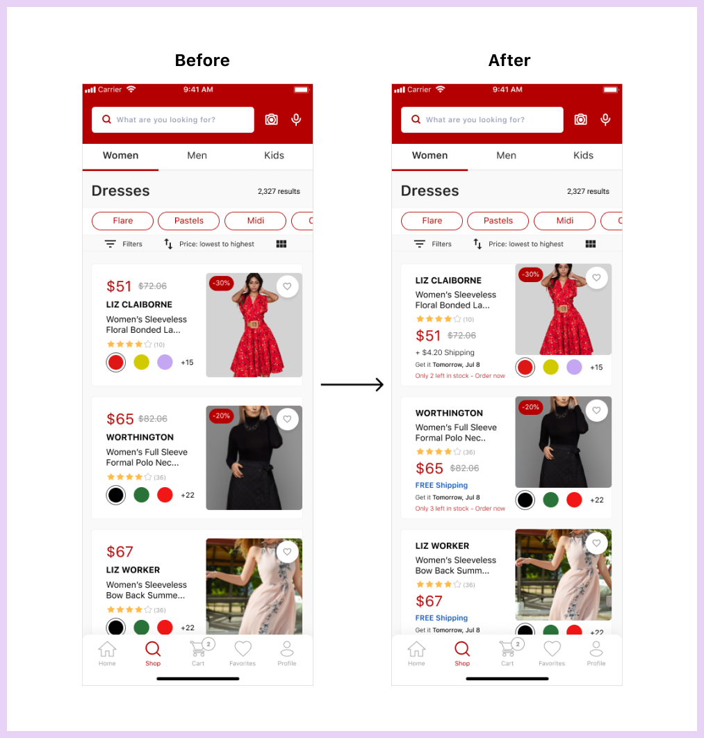
Usability Testing
During usability testing of the high-fidelity prototype, test participants were asked to select a product they were interested in buying from the catalog page. Though participants did not have any confusion in making a selection, they felt that adding more details about the product such as shipping charges, estimated package arrival date, etc., on the catalog page rather than on the product page would save them a lot of time when making a selection. Based on this suggestion, I made necessary changes to the design by adding relevant product information that could help customers take decisions easily.
Final Design
After updating my design based on the results of the usability testing, I had my final design reviewed by other senior designers. Their feedback helped me make the finishing touches to my design.
VIEW PROTOTYPE
Takeaways
Overall I enjoyed working on this project. I learned a lot about the retail industry and an e-commerce UX. My biggest takeaway was understanding how small design changes can make a huge difference in the way users perceive a design.