Ride
UX Design | UI Design | Prototype
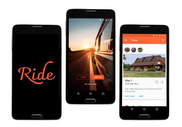
Ride is a day trip planner app that automatically creates trip plans for users based on their needs. The goal of this app is to help people plan day trips quickly and easily without having to spend hours on the planning process.
VIEW VIDEOProblem
Going on a day trip is always fun. But do we always get enough time to plan our trip ? No, Not always! Planning trips can be challenging and stressful, especially if you only have limited time and budget. A person who wants to plan a day trip feels overwhelmed by the number of suggestions he or she finds online. There is a need to consolidate and present this information such that one can quickly decide the places to visit without spending hours on the trip planning process.
Solution
I designed a day trip planner app that focuses on addressing the current problems of users and helping them plan their day trips without spending too much time and effort.
Process
User Interviews
I started my research by conducting an online survey to better understand my end users. My focus was to understand the frustrations and challenges faced by people who were trying to plan a day trip.
User Interview Results
- 60% participants said they found it very difficult to find good local tourist spots.
- 40% participants said they did not have enough time to plan a trip.
- 68% participants said the most important thing they considered when choosing a spot was the distance they would have to travel.
- 68% participants said they chose locations based on the type of activities they wanted to do.
- 76% participants said that having options to filter based on distance, price, activities etc., was very useful to them when planning a trip.
Based on this data, I got a better understanding of people's needs while planning day trips.
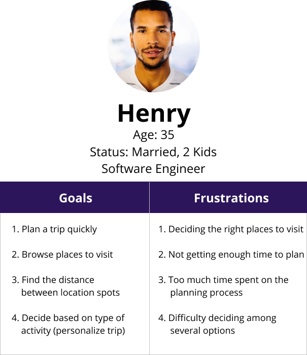
User Persona
Next I created a user persona where I highlighted a user's goals and frustrations while planning a day trip.
Competitive Analysis
Next, I analyzed three of my competitors, Google Maps, Tripadvisor and Expedia. While Google Maps provides a list of places to visit nearby, it is difficult to create a plan that optimizes time and distance of the trip. In the case of Tripadvisor, though they provide a list of places, planning a trip with the information provided is confusing as well as time taking. Expedia focuses mainly on hotels and travel bookings and not short duration trips.
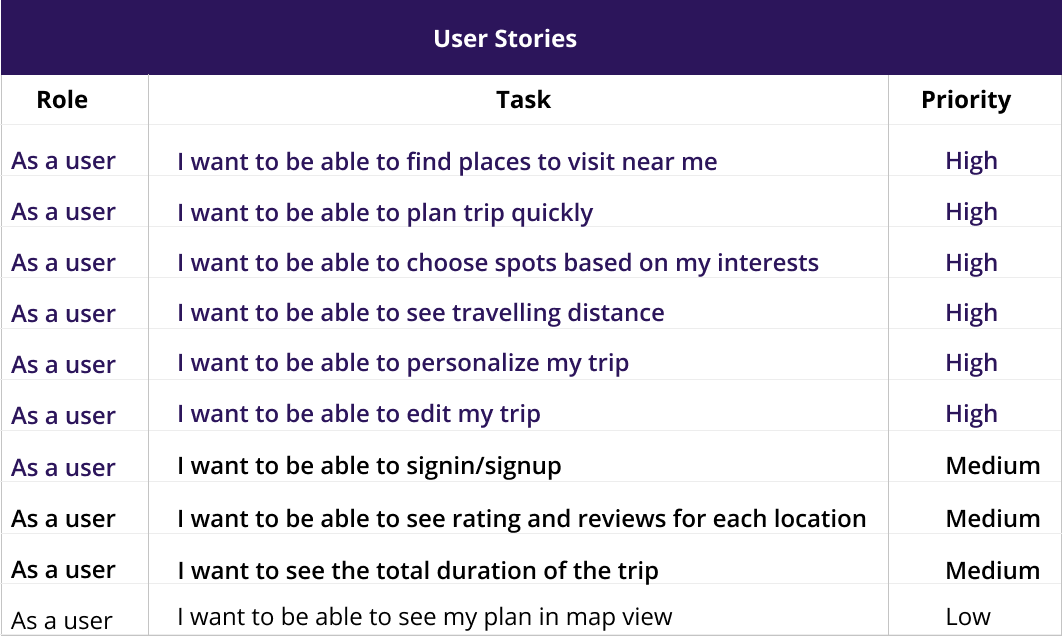
User Stories
With a better understanding of my users' needs and challenges, I moved ahead with creating user stories to capture product features and functionalities.
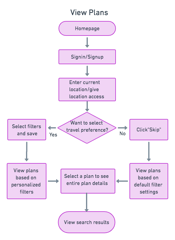
User Flows
Next, I created user flows to define the various steps a user would take. Not only did this allow me to focus on what the users needed in order to complete each task, but it also helped me deliver the user experience in the most effective manner possible.
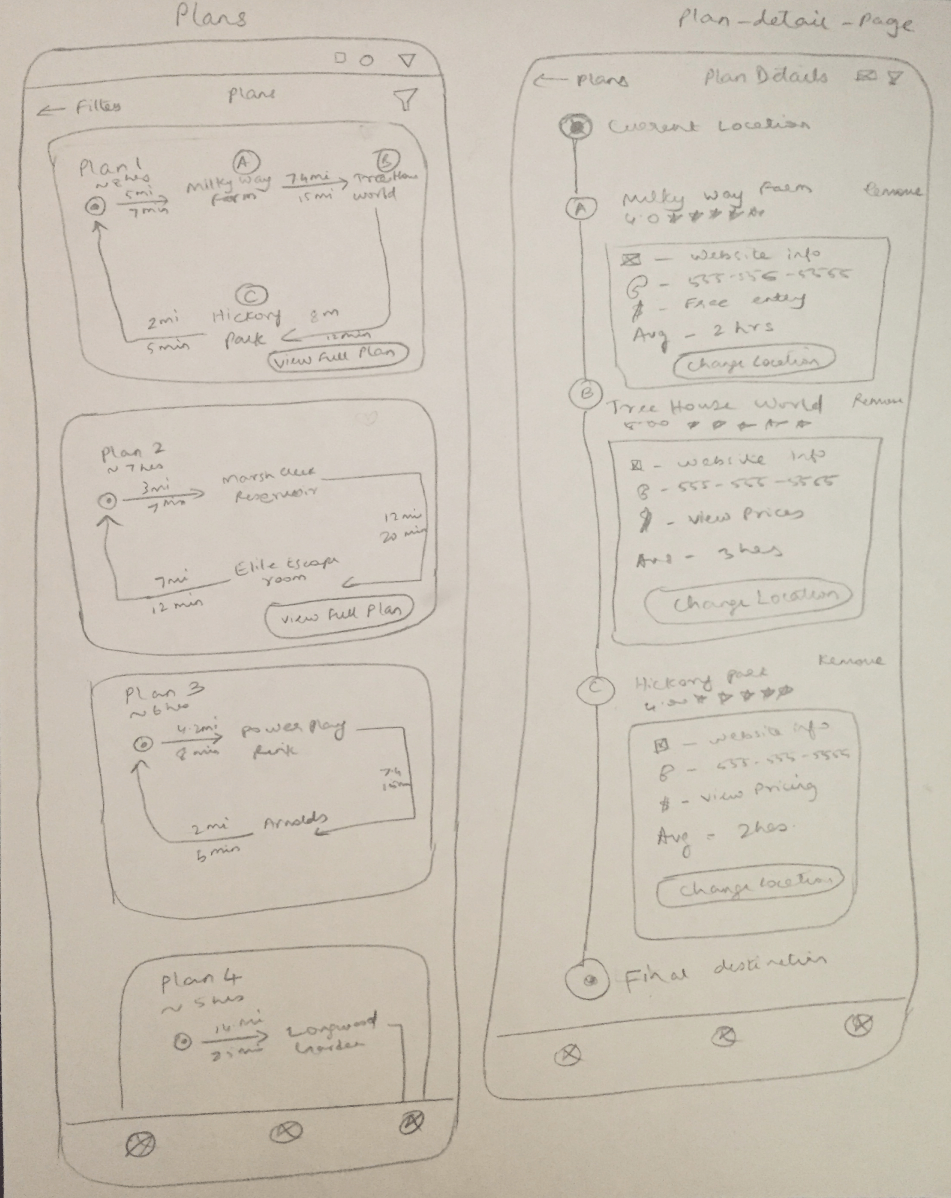
Sketching
Once I captured and prioritized all the insights from the research phase, I began to design the app. First, I sketched several of the site’s main screens using my user flows as a guide.
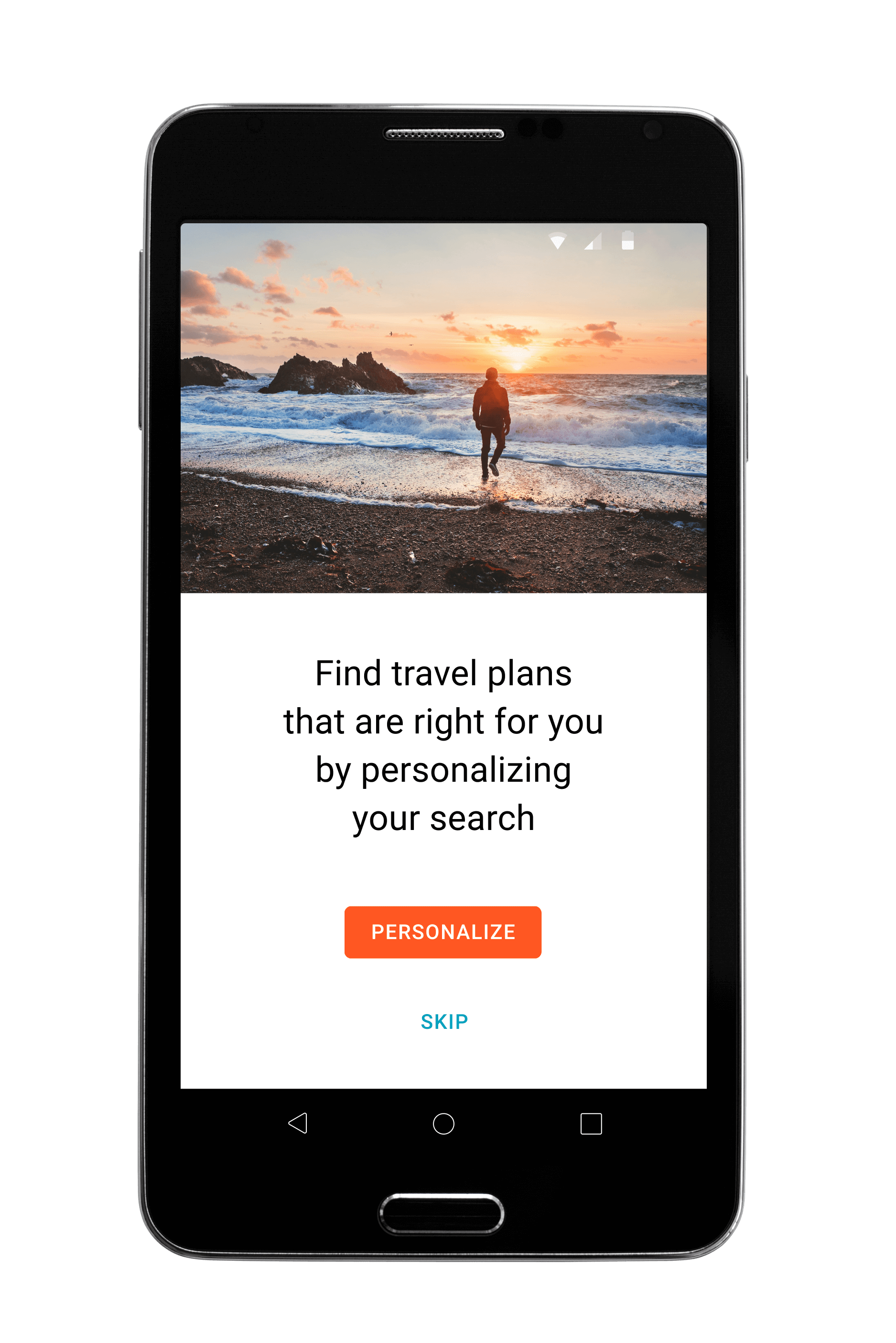
My main goal was to provide users with multiple trip plans optimized for travel time and distance between locations. With this goal, I created a design where the app automatically generates a plan from scratch based on inputs from ther user. While sketching the homepage I mainly focused on providing an easy way to help users understand the various day trip plans generated by the app.
Wireframes
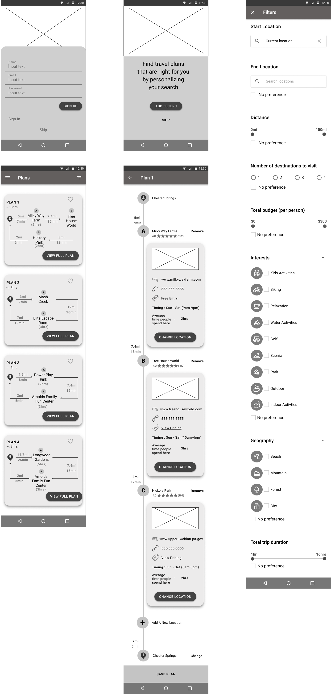
Next, I began to design wireframes using Figma. I made sure to prioritize the features that best addressed the needs of users.
Usability Testing for Wireframes
Tasks:
1. Signup for an account
2. Add filters based on your preference
3. Choose a plan and view details of your chosen plan
4. Change one of the locations to another new location
5. Remove one of the locations from the chosen plan
6. Add a new location to your current plan
7. Save your plan
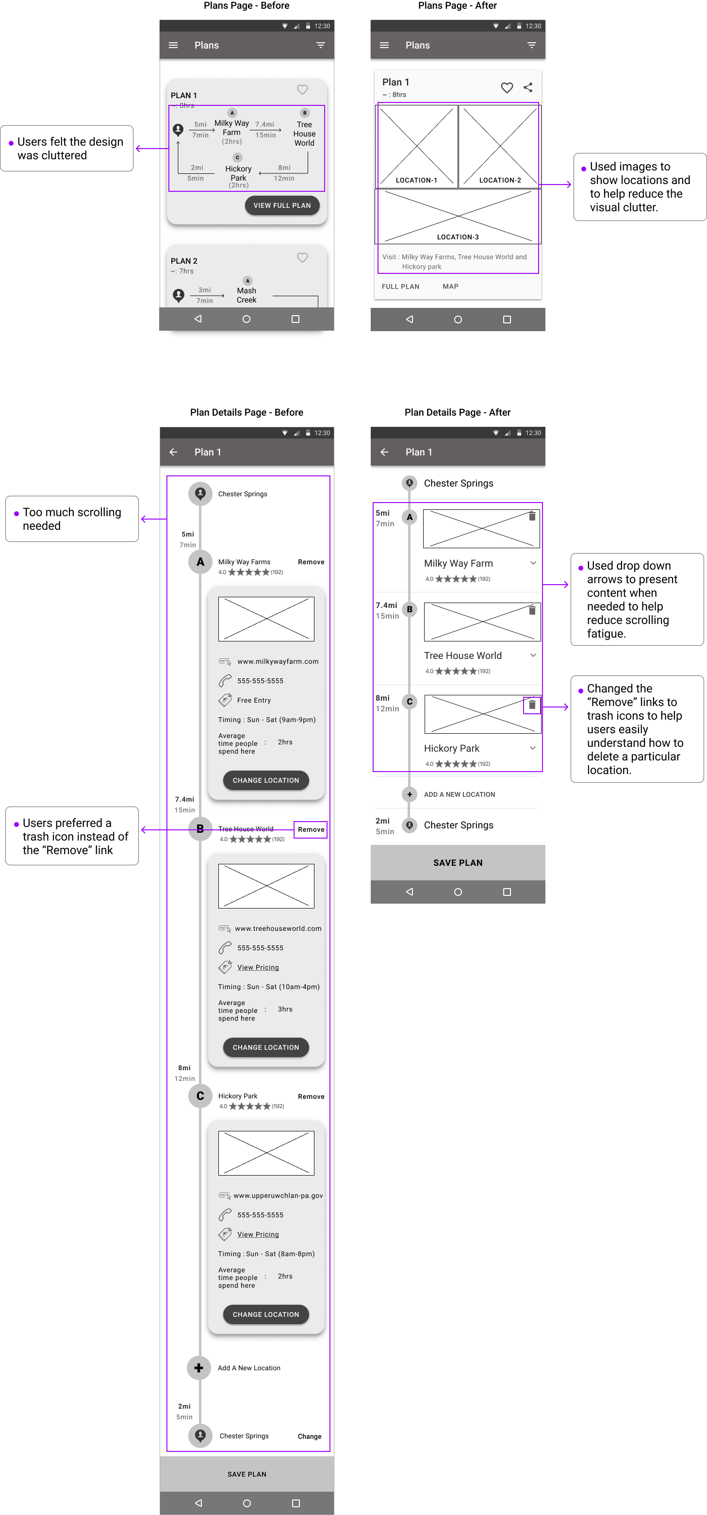
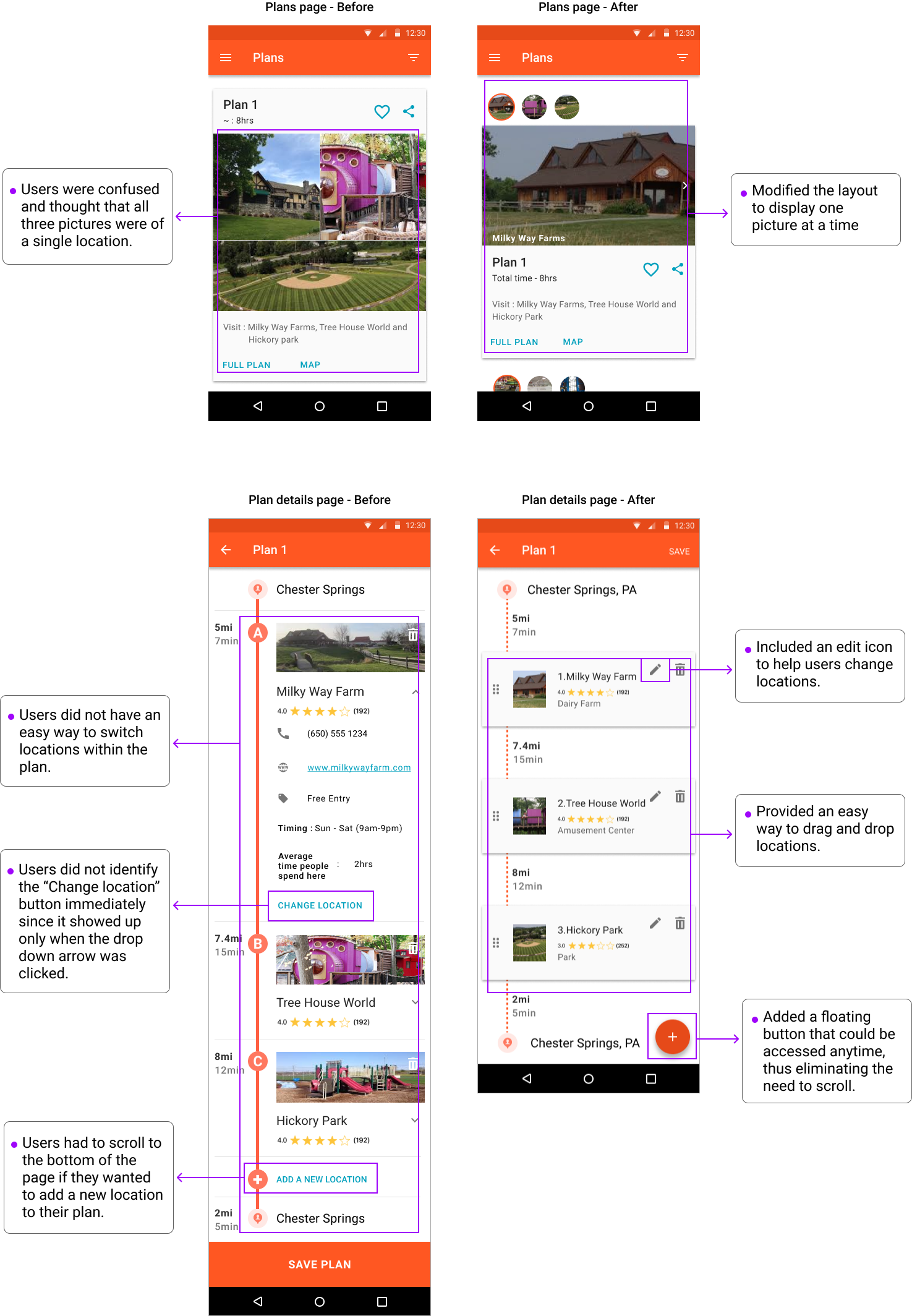
Usability Test Key Findings & Iterations
Branding
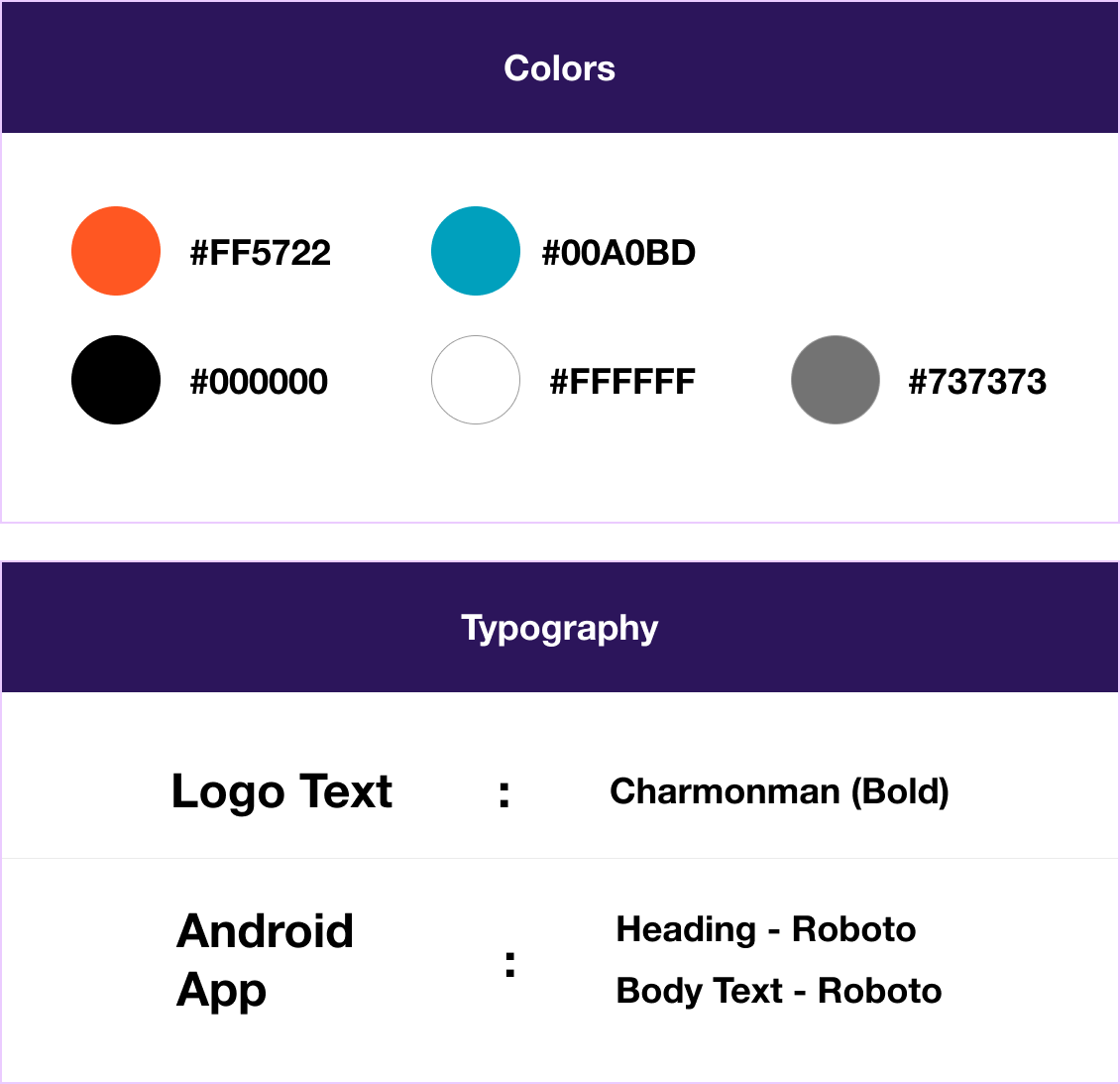
After updating my design based on the results of usability testing, I proceeded to work on my branding. I selected the name "Ride" for my product because this name immediately resonates with travel. Next, I decided to go with orange as my primary color and Cyan as my secondary color as these two colors promote the feelings of excitement, energy, enthusiasm, relaxation, and happiness and gives users a vacation feel. These were the feelings I wanted to invoke in my users while using this app. While selecting the typography, I decided to go with 'Robot' because this typeface is compact and easy to read.
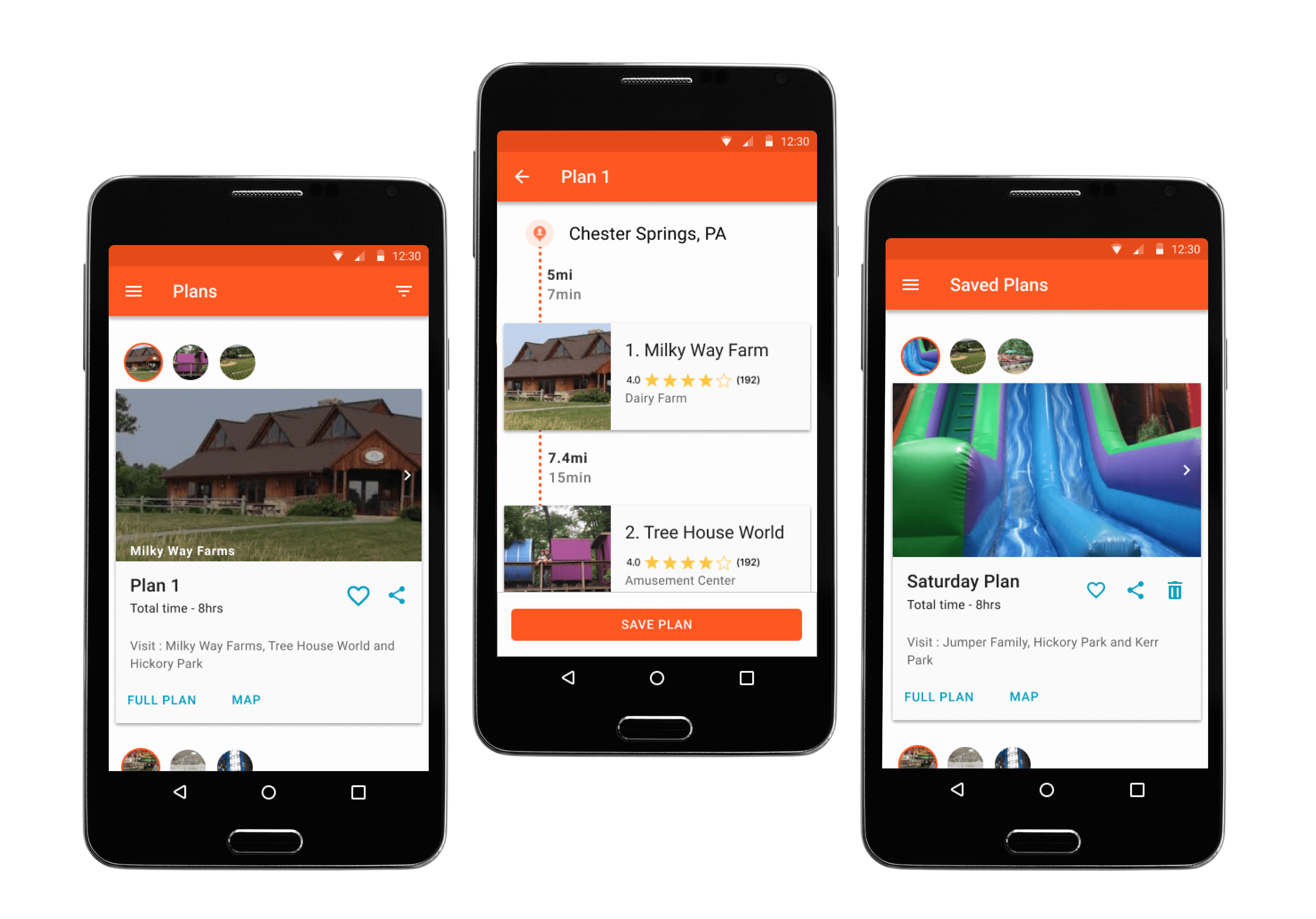
High Fidelity Mockups
With my color and typography finalized, I started to work on my high fidelity mockups using Figma.
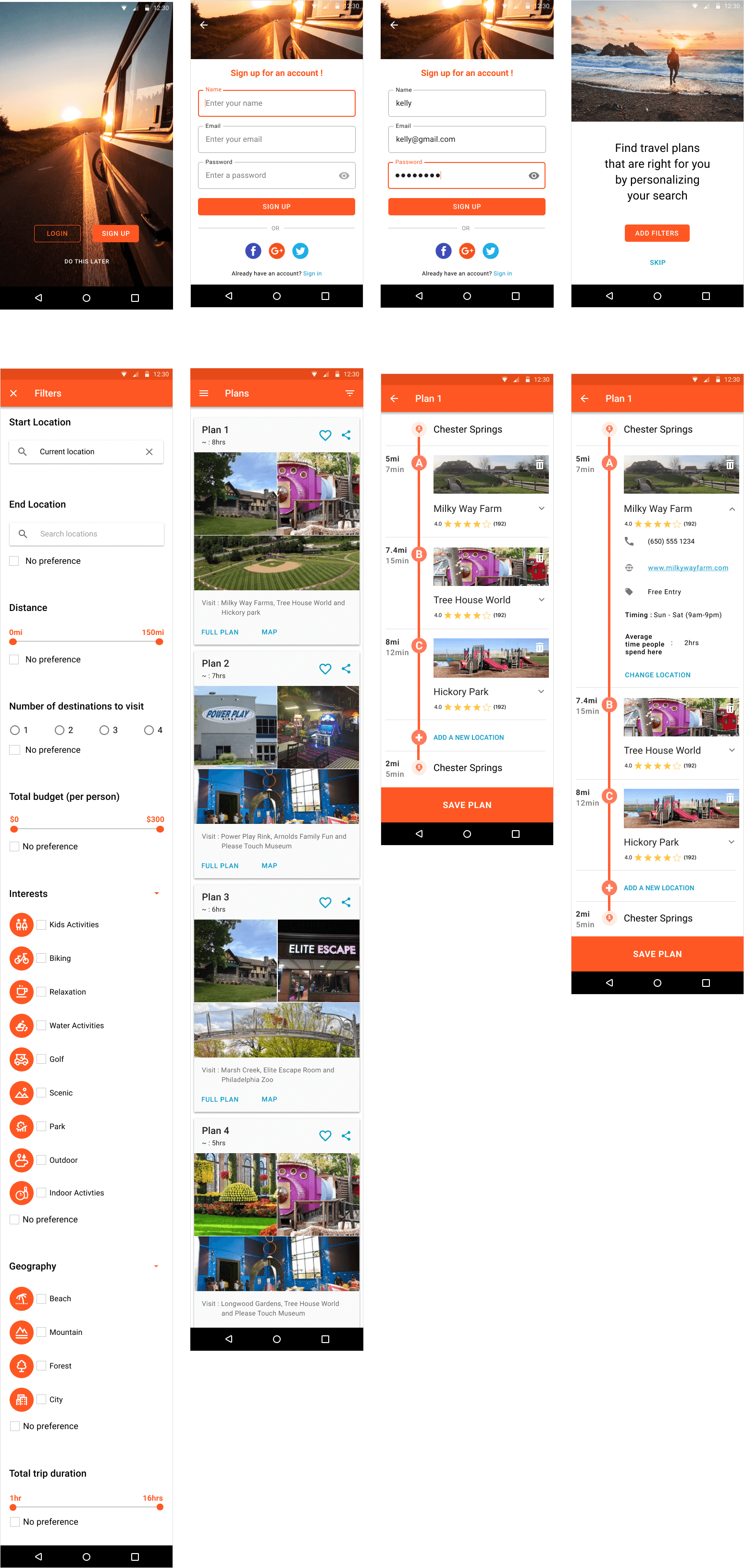
Usability Testing Round-2
Next, I conducted a second round of usability testing to evaluate my design decisions and confirm my assumptions. During this round I gave my participants the same set of tasks that I had given them previously, but this time I asked them to voice their thoughts on the visual aspects of the design as well.
Key Findings & Final Iterations
Takeaways
Ride boosted my confidence as a researcher and a designer. There were several moments when I felt unsure if the solutions was going to be useful to users and whether it was truly addressing their pain points. However, when I saw the users performing the tasks effortlessly during the usability test, it gave me confidence to move forward with the project.
 VIEW PROTOTYPE