He Rose
UX Design | UI Design | Responsive Web Design
 VIEW WEBSITE
Problem
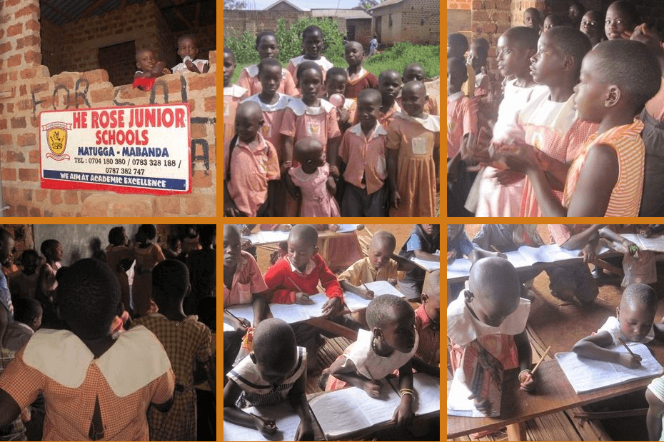
He Rose Community Ministries (our client) is an Ugandan non-governmental organization founded in 2012. They aim to provide full community support to orphans, children living with HIV/AIDS and other vulnerable youth by providing them opportunities to pursue their education to become agents of social change. Their challenge was that their official website was not attracting enough donors and due to this, their junior school, where children get food and education, had to be closed. Therefore, He Rose aims to raise funds for the school and reopen the junior school as early as possible.
Solution
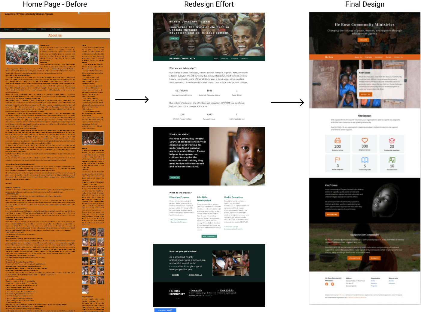
To solve this problem, our team came together to continue a previous redesign effort to improve the He Rose website. Our main goal was to encourage website visitors to donate.
User Interviews
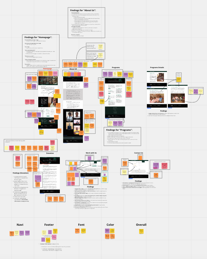
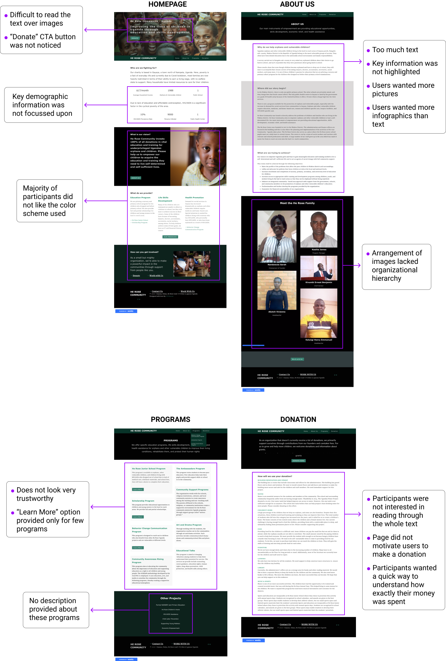
Since a website already existed, we judged that it would be useful to perform a usability test on the old website to identify confusing navigation features and roadblocks in the delivery of content. The purpose was to better understand how the target users think and respond while using the website. This helped the team focus on the most important things to make a real difference, and optimize the new site more efficiently. Each team member met with a user to ask them questions about the previous redesign of the He Rose website. Comments from the six users were gathered on a Miro board where we organized the feedback and suggestions from our usability tests
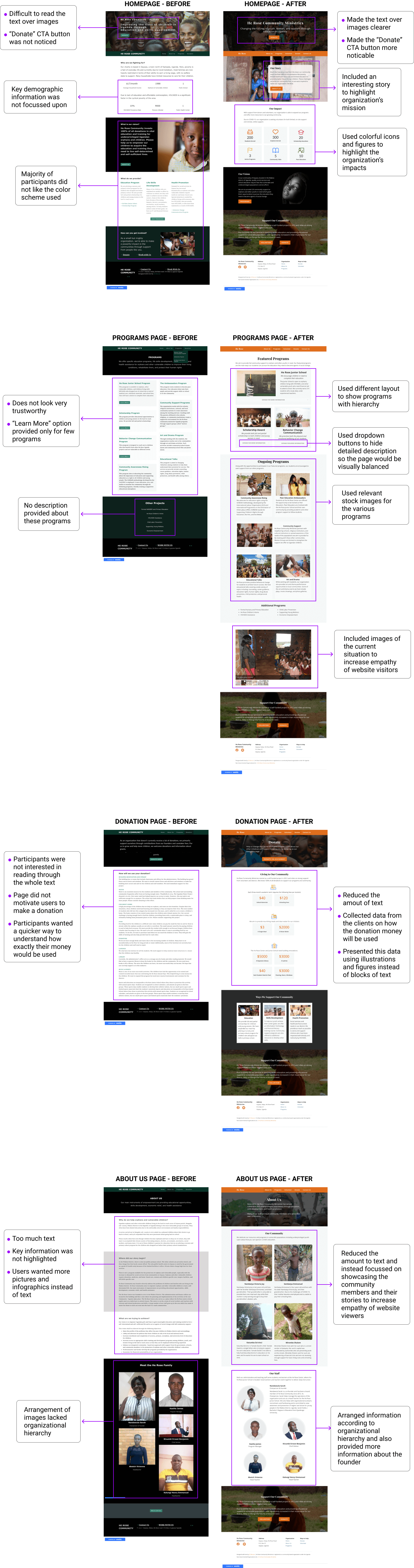
Our Key Findings On The Old Website
Our next steps
Our research findings gave us valuable information on the most important features to focus on. It was clear that the content strategy team will need to build user trust by keeping the content of the website simple and concice. The design team needed to tackle the tone issue on the website by using consistent brand colors and visual hierarchy.
Our key focus points
- Reduce overall text and make the content quickly scannable to help viewers easily understand what the community does.
- Improve content, visuals and branding to make the site look more trustworthy.
- Improve visual hierarchy and consistency to better guide the user.
- Set up a design system that included basic elements like brand color and typography that reflected the community's values.
- Redefine Information Architecture as certain important information was not noticed by users. (e.g. Volunteering).
Competitive Analysis
We also conducted a competitive analysis on six websites: Nyaka, Uganda Hands for Hope, Backup Uganda, IYF, Educate!, Unemployed Youth Africa. Following were our key takeaways:
1. The competitive communities had a story/narrative around which the website was designed.
2. There was a satisfactory sense of overall brand personality and visual design.
3. Websites made use of strong icons and demographics to communicate/highlight key information.
4. Information was strategically shared in an easy-to-consume manner.
5. A design system was used to keep the website consistent.
6. Relevant images were displayed that could emotionally resonate with users.
These analysis illustrated the need to source images from He Rose, reduce the amount of text needed to be read, and further confirmed some of the pain points from our user tests. From there, our team was ready to work on the branding tasks.
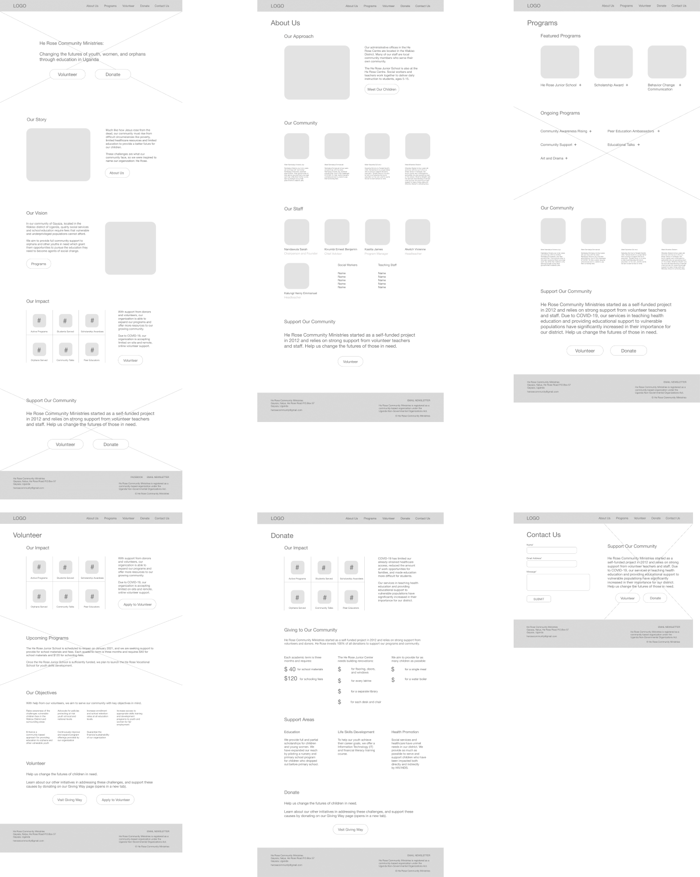
Wireframes
Branding
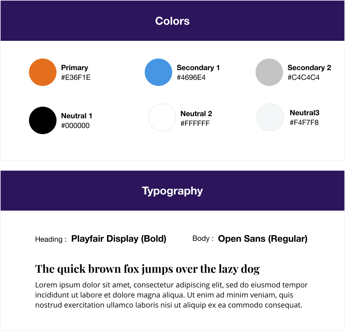
To create a representation of He Rose Community's brand, an exercise was performed where each team member chose a handful of words that described the brand persona as per the product objectives. These keywords were further shortlisted to define the brand accurately: "Trustworthy, Helpful, Welcoming, Accountable, and Impactful."
A similar exercise was conducted for typography where different fonts were paired, and the most suitable fonts were identified for the project.
The brand colours were also considered that aligned with the theme of the earlier website and expressed emotions such as care, honesty and trust.
Major Design Changes
While branding was important for this project, there were certain platform limitations we had to work with. From a previous comparison of different website platforms, we decided to keep using the free version of Weebly, which only includes basic access to customize website templates. This limited where text could be placed as well as certain design choices.That said, we were still able to impliment most of the changes we wanted to make.
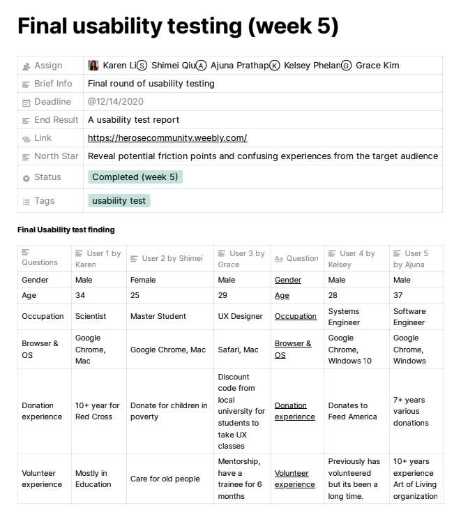
Final Usability Testing
Once we had made the intended redesign, we conducted an additional round of user testing to confirm the reduced pain points and determine if there were any additional issues. Our team was excited to see that our efforts were well-received.
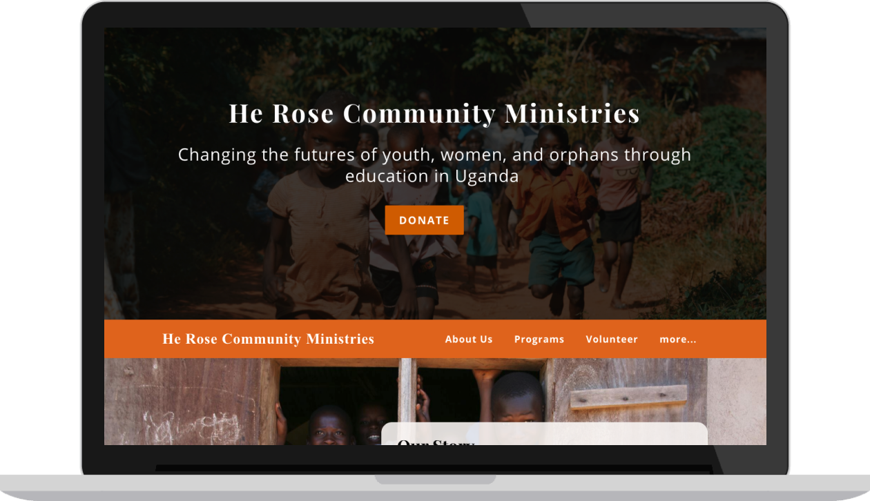
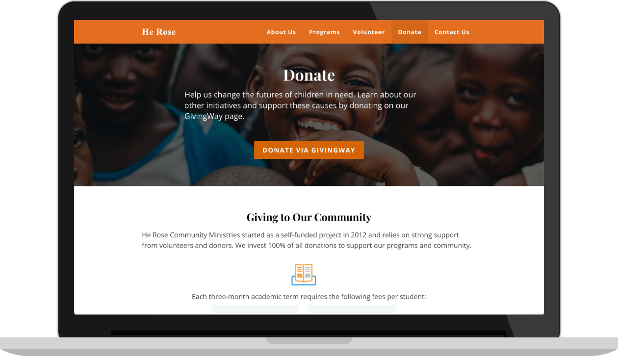
Final Design
The newly found pain points were minor, and we addressed them before our deadline. Each team member was assigned a checklist to confirm we had tackled everything before our handoff to the client. The handoff consisted of final discussions and an internal review of our work. After iterating from the second round of user testing, we saw future improvements for the website. Our team decided to provide He Rose with recommendations for the future to help their organization thrive.
 VIEW WEBSITE